Smolbol™ - Brand Identity
Mismi Foods© NY/US
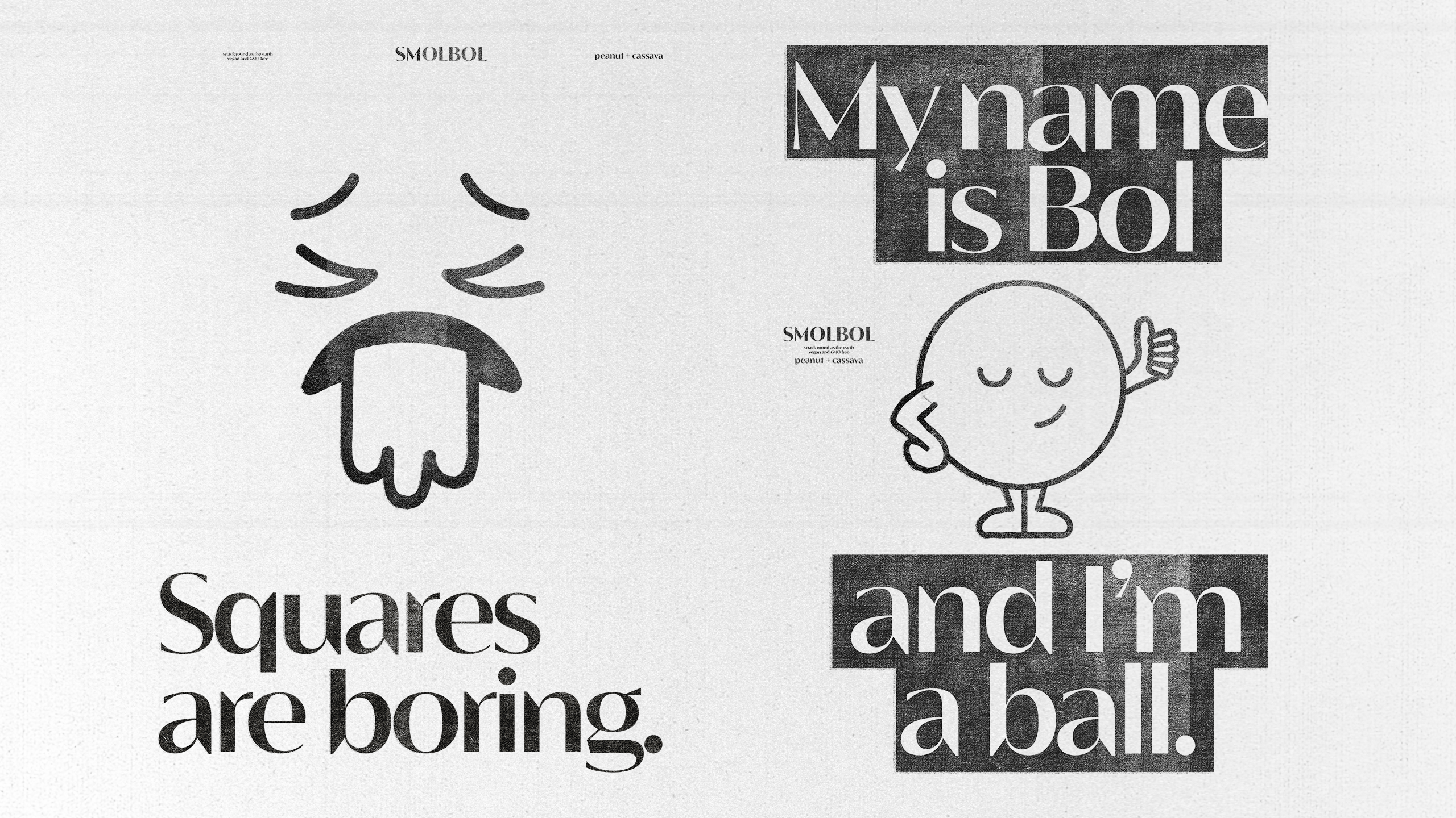
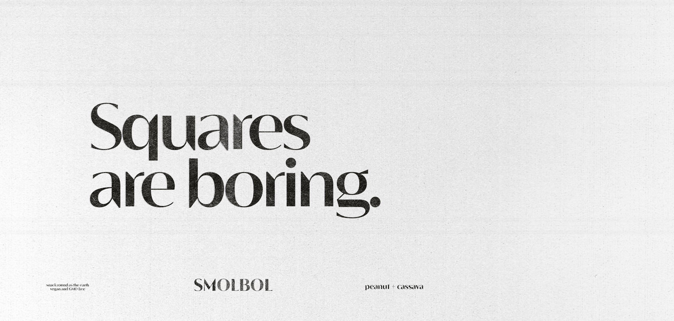
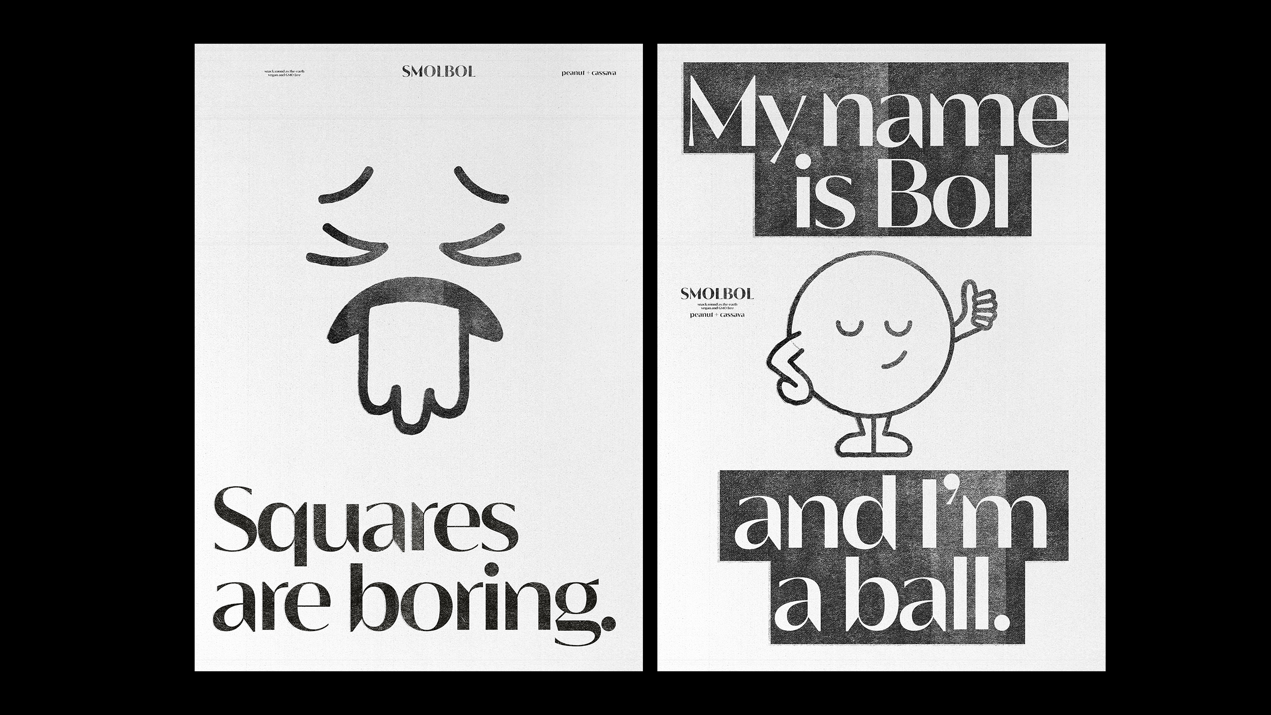
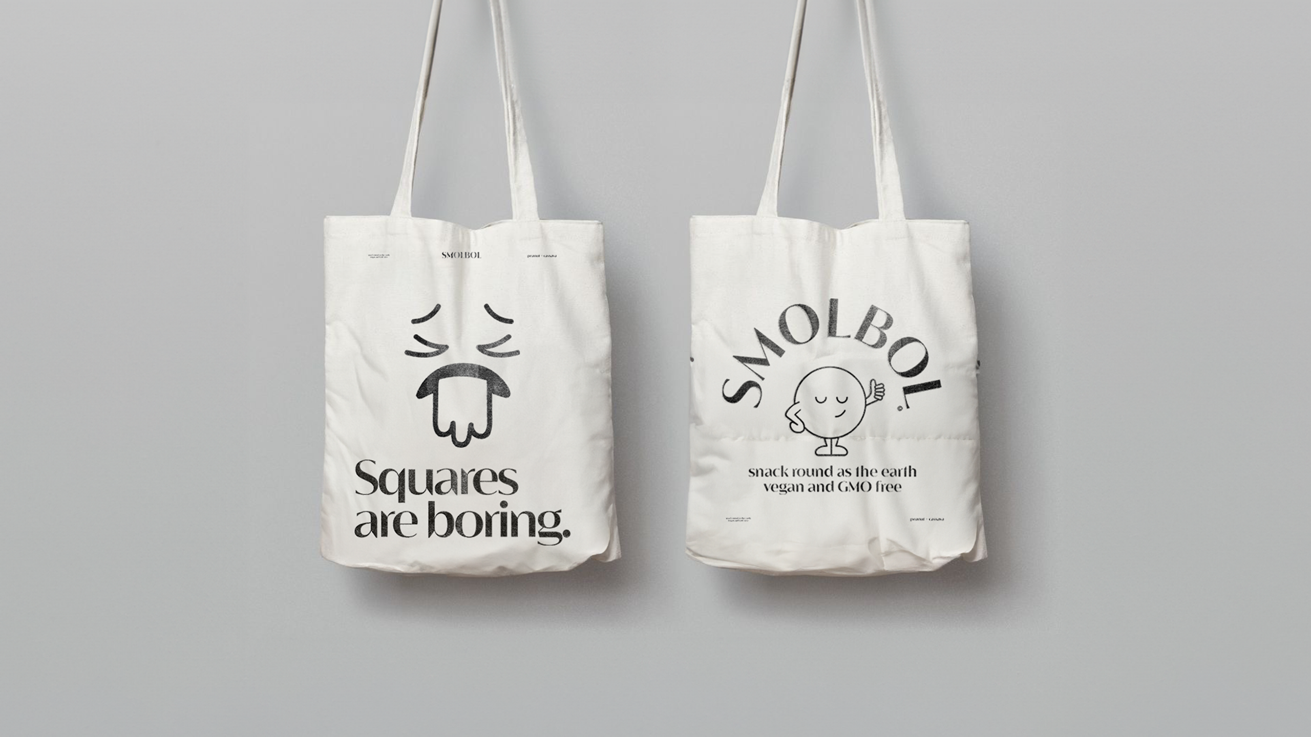
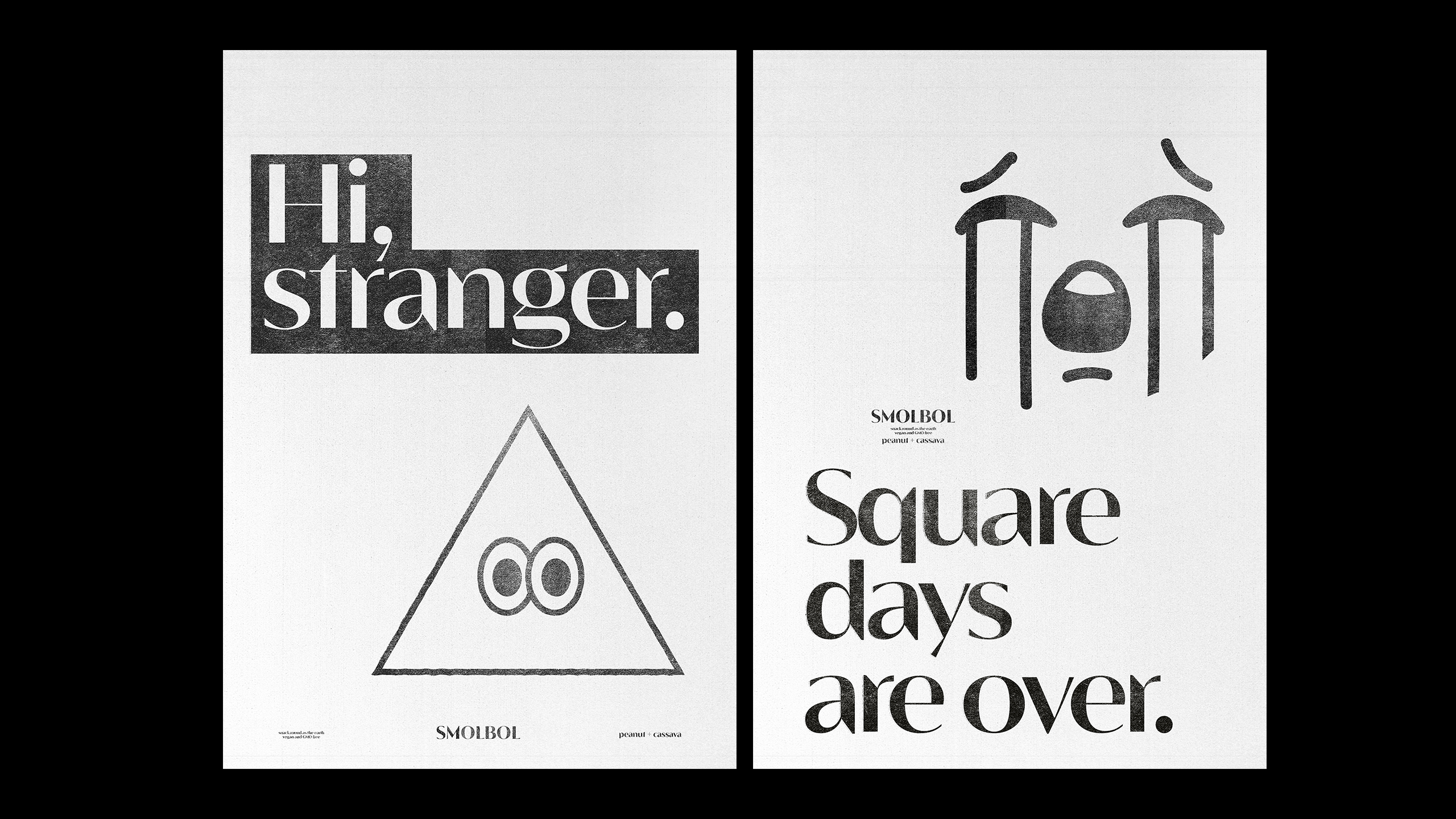
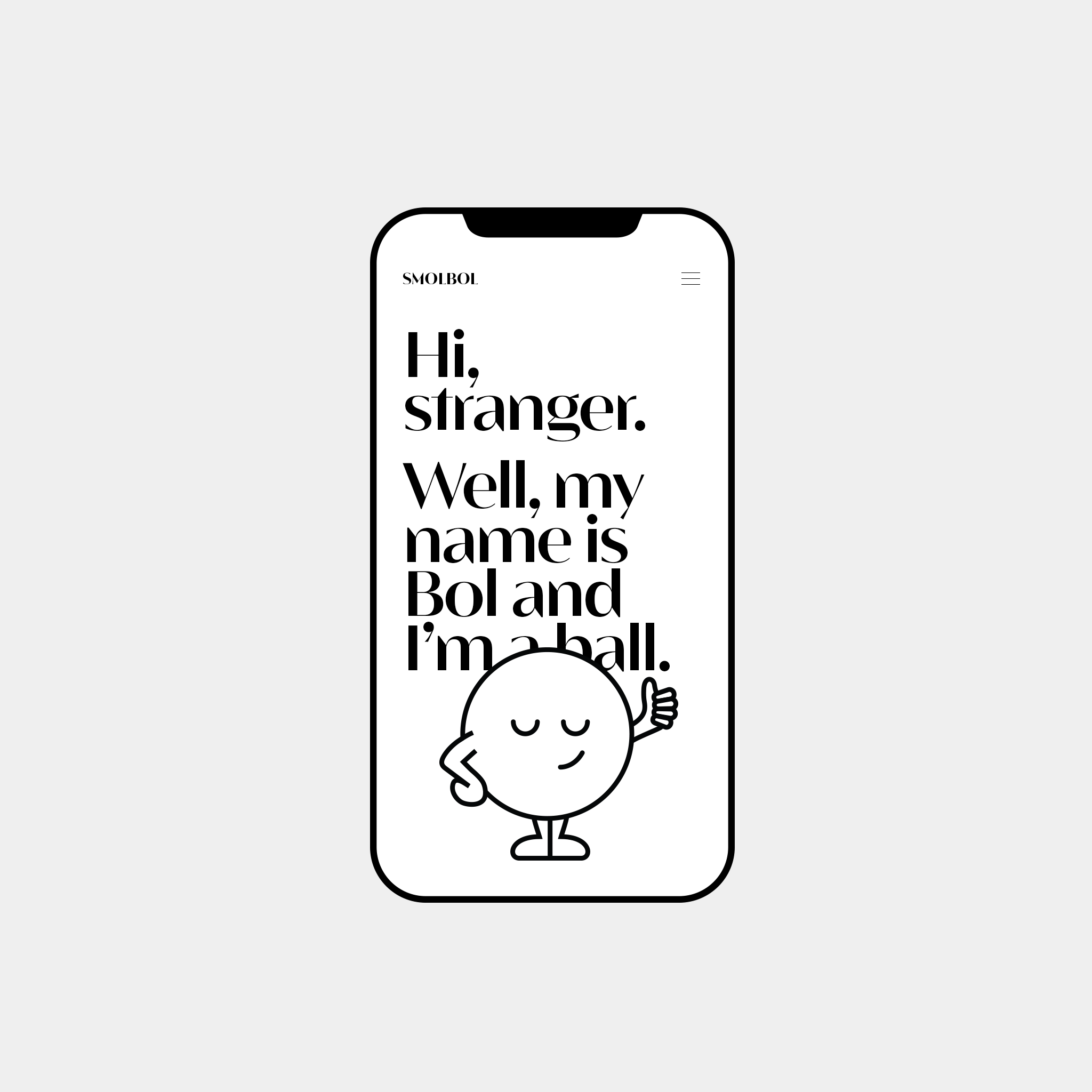
The world is so complicated, with so many edges. It even looks like it's square!
Round ideas always bounce out of the box.
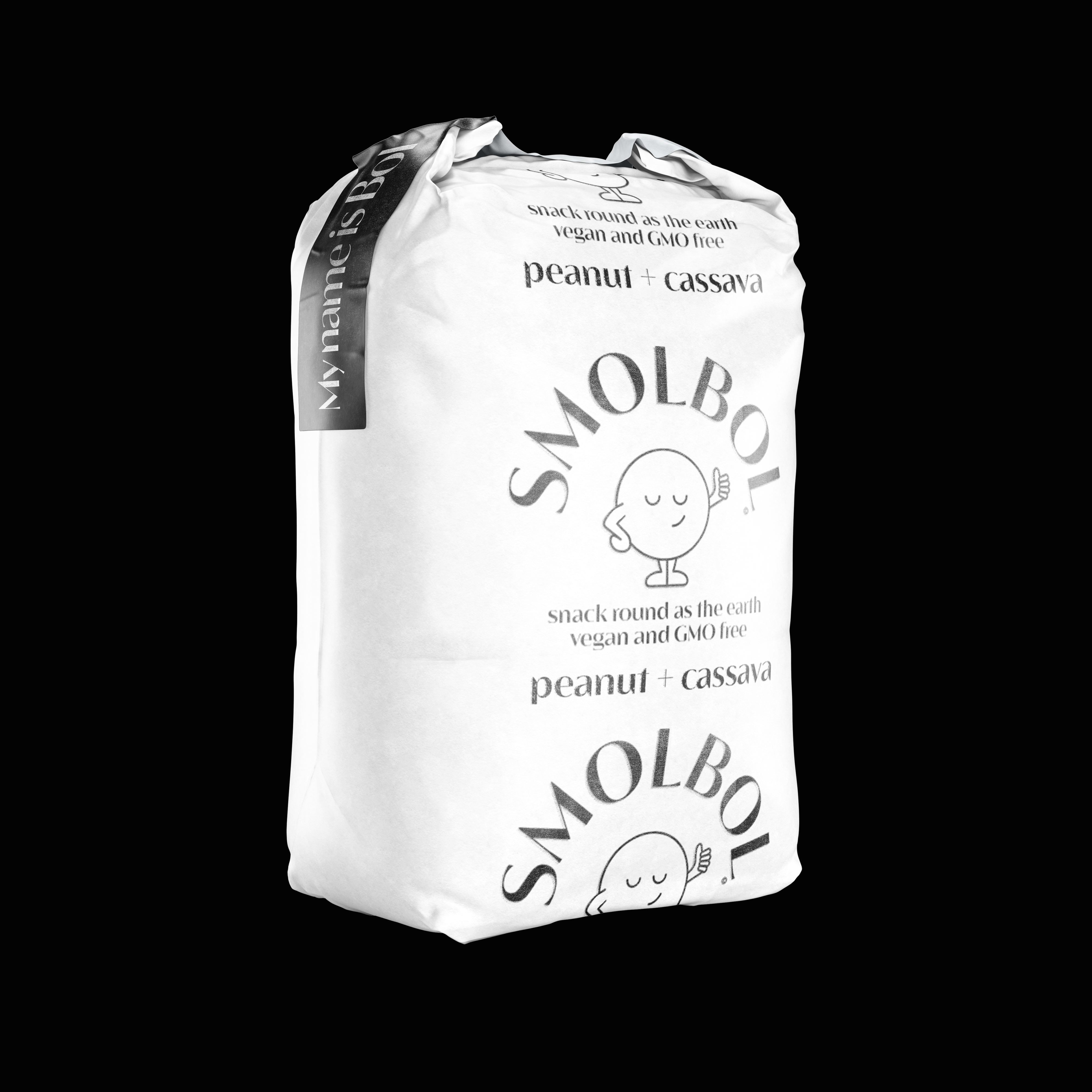
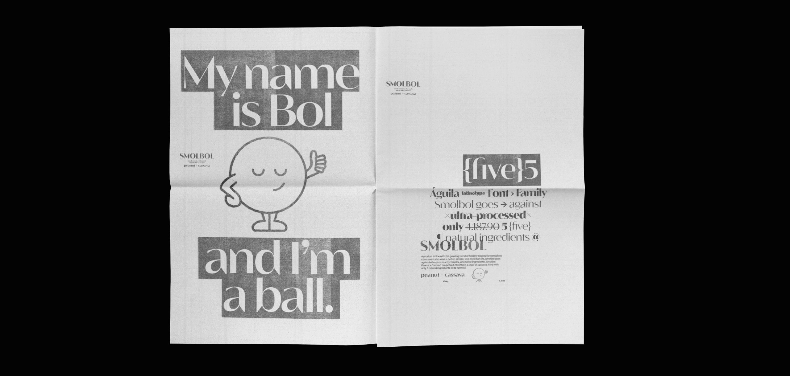
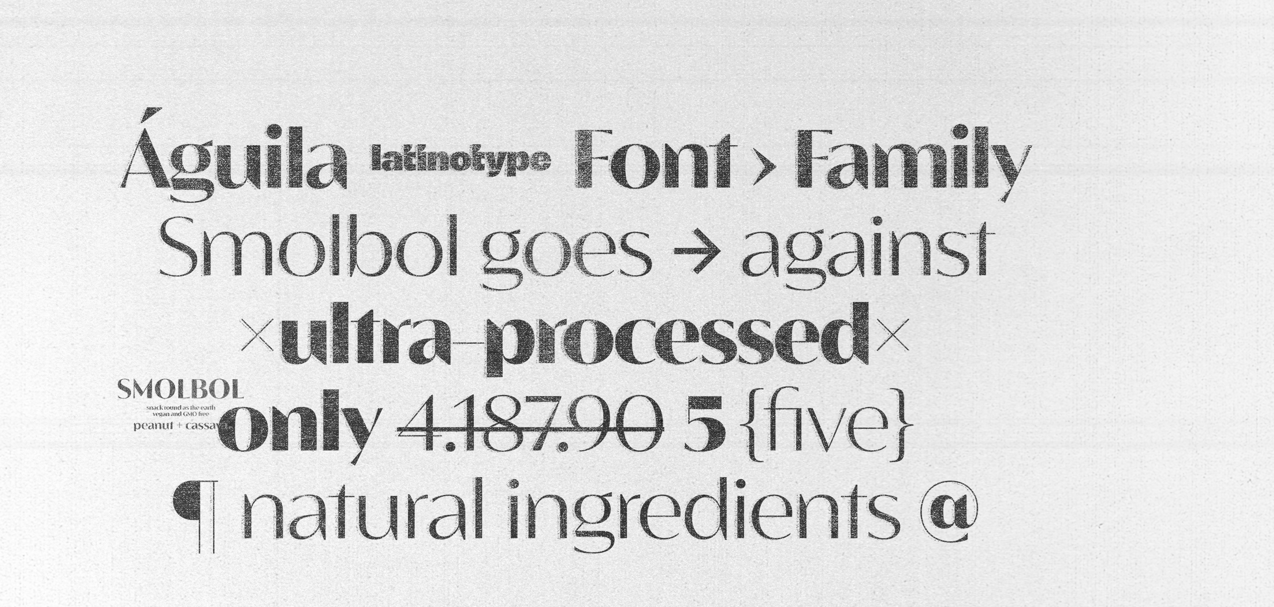
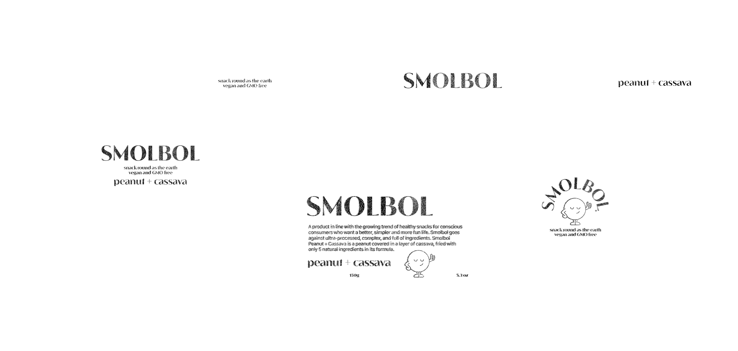
With this insight, we seek nature's simplest way to sensorially synthesize the brand's meaning. the sphere. The entire line of Smolbol snacks has as a rule the simplicity of this geometry.
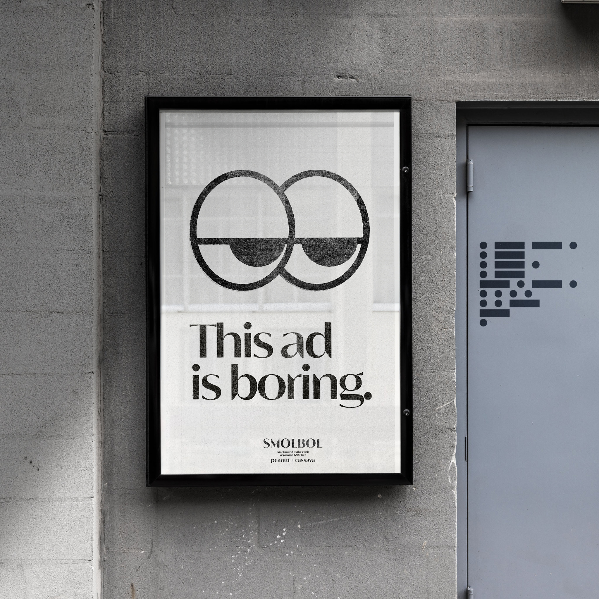
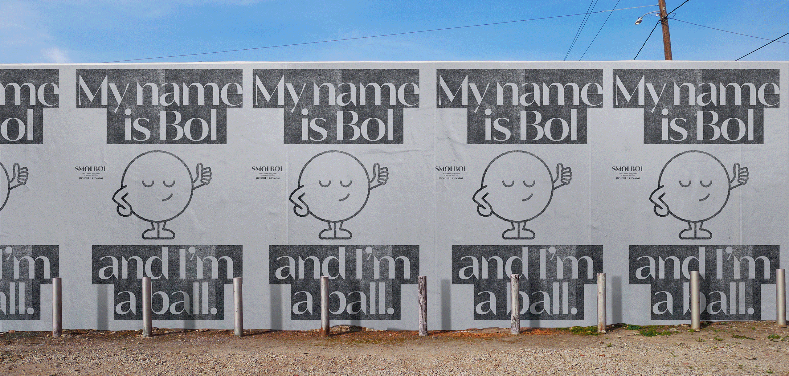
We positioned the brand in the territory of innovation, supported by the perspective that every great idea is based on an almost naive simplicity. We adopted a non-traditional activation strategy: being a product category linked to specific consumption occasions, such as happy hours or afternoon snacks, we activate the brand in the creativity market, especially in the startup innovation market, in a light, provocative way and full of humour.
Project: Graphic Design/Branding
Role: Visual Leader/Graphic designer
With: Thiago Thome, Maria Julia Brito, Thais Navarro, Julia Navarro, Leo Massarelli, Barão di Sarno
Agency: Questtonó Manyone