HP Hewlett-Packard - Visual Identity
Shape the Future of Work
HP’s brand was restructured, simplifying its architecture to drive greater consistency across global markets. To achieve this, we refined its two core assets, the logo and its blue color, and built a cohesive brand identity system around them, which we named the Stripe System.
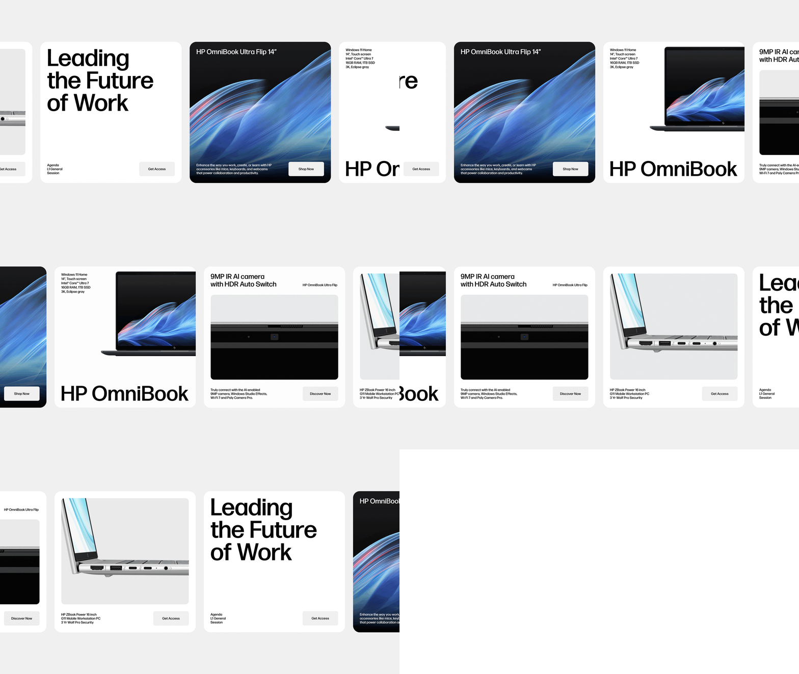
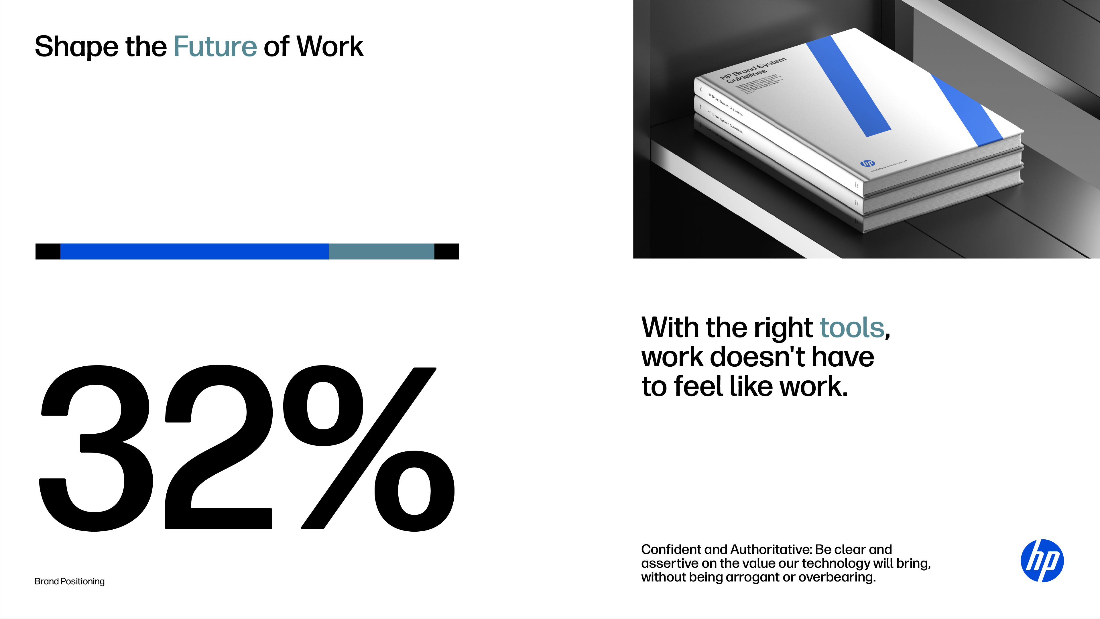
The work also included the creation and implementation of the new positioning, “Shape the Future of Work,” across all brand touchpoints.
Photography
A collection of One HP brand imagery on the newly designed photography guidelines page.
Brand Line Motion Files
The brand line consistently across branded content with new motion files.
Additional brand guidance
New Alliance and Signage guidelines that extend the core brand guidelines.
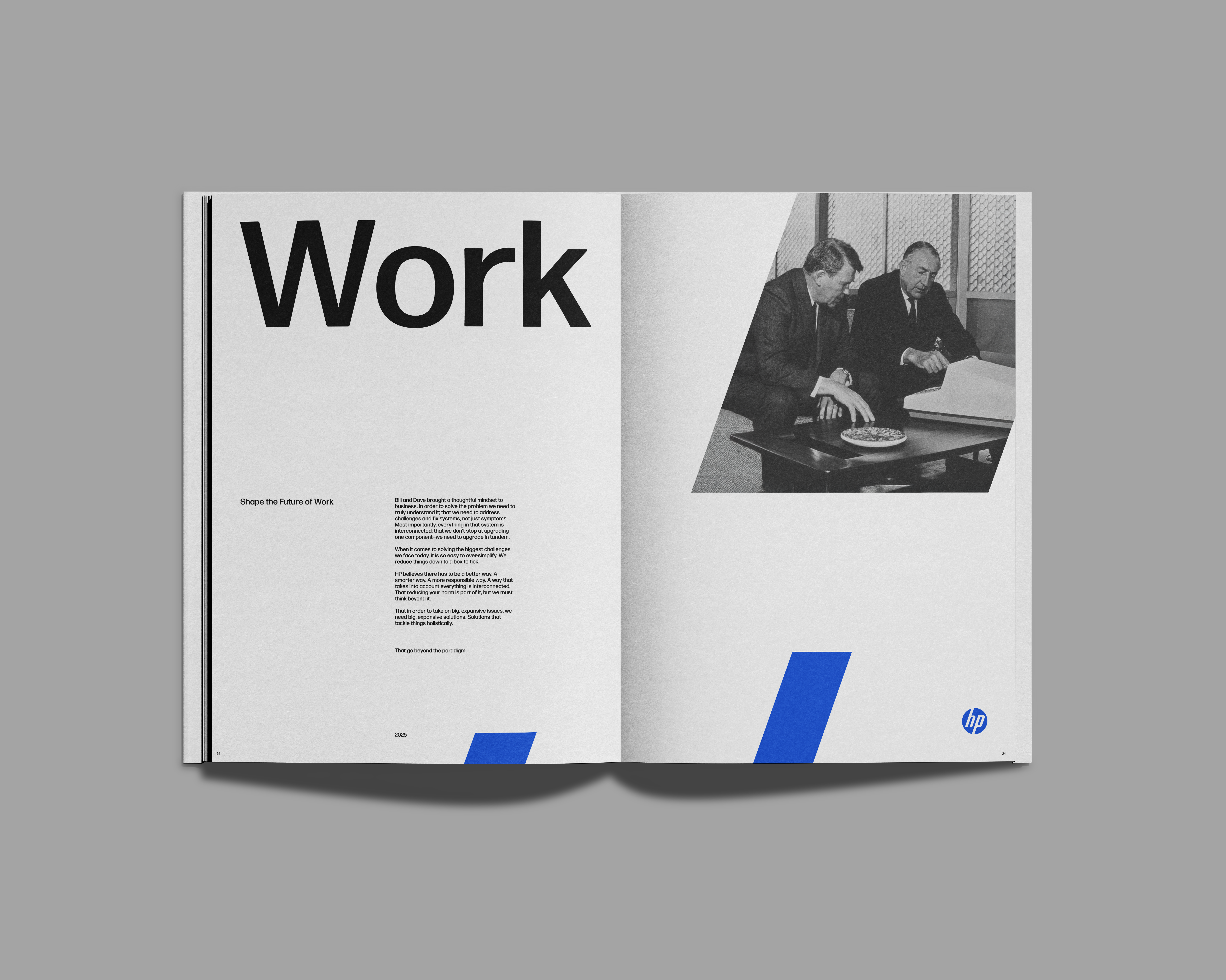
HP was founded on a partnership that transformed the relationship between people and work. Over the years, the company has continued to evolve. Now, we are embarking on a new chapter to shape the future of work, staying true to our founder’s heritage while adapting to the present. In support of this new chapter, we are reclaiming the blue and elevating our logo as a distinctive asset. With our new brand strategy and our new visual assets and guidance, we will show up as One HP confidently and consistently.
-
Project: Visual ID
Agency: Droga5
Role: Design Director
With: Diego Limberti, Rodrigo Bonfim, Fabio Cristo, Marco Loschiavo, Gustavo Ohnuma, and the Droga5/NY Team